
Wigmore Medical
Wigmore Medical is a pharmacy based in London and is one of the UK’s leading outlets for all products associated with the aesthetic medical sector. Not only do Wigmore provide a wide range of pharmaceutical and aesthetic products they also host a variety of training courses and webinars for the medical industry that can be purchased & booked via their website.
Project Overview
Challenge
Wigmore’s eCommerce website is used by health professionals and clinics to buy and prescribe medical products for their patients, and to also book rooms to host training courses and webinars that are available to purchase tickets via the website. My task was to modernise the UI and to simplify the user experience to improve the
Solution
To modernise and redesign the website, to simplify the user journey in signing-up to the website, purchasing products, assigning prescriptions to patients and booking training courses and webinars.
Role
UI / UX Design
Tools
Adobe XD, Photoshop, Illustrator, Maze
Website
My Process
1. Empathise
Firstly, I had to familiarise myself with Wigmore Medical and gain an understanding about their company, industry and users. As I was working in Wigmore Medical as an employee, I was quickly able to learn about their background, goals, needs, motivations and frustrations by conversing with the owners, management and fellow employees. To learn more about the pharmaceutical eCommerce industry I conducted secondary research to identify their current competitors, analyse previous feedback made by their users about their experience with the website and to evaluate the strengths and weaknesses of the website.
Research
In preparation to dive into my research, I first set some clear goals and created a research plan that would guide my research process.
-
Understand the market trends of the pharmaceutical & aesthetic industry
-
Identify Wigmore’s competitors and to evaluate their strengths & weaknesses
-
Discover the goals, needs, motivations, and frustrations of Wigmore’s users
-
Understand the experiences people have online and offline
I wanted to learn and understand the trends and best practices in the online pharmaceutical industry. I began by completing a market analysis as well as a competitive analysis. I reviewed online pharmacy websites and companies that offered similar solutions to see their approach, strengths and weaknesses.
Through market research, I was able to gain a more thorough understanding and fill in the gaps of my knowledge about the industry to better inform my design decisions moving forward. Here are some of the key insights that I discovered:
Market Research
-
The market is expected to witness a drastic growth over the COVID-19 pandemic. The lockdown and travel restrictions, along with the fear of getting infected with the SARS-CoV2 virus, led to an increased dependence on online pharmacies for the purchase of both over-the-counter and prescription drugs.
-
In January 2019, Swedish online pharmacy company Meds focused on expanding its online business across Europe by raising €5M. Meds sells beauty and health care products, as well as non-prescription and prescription drugs.
-
In August 2020, Amazon launched its online pharmacy service, named “Amazon Pharmacy” for both over-the-counter and prescription-based medicines in Bangalore, India.
-
In March 2021, Phoenix UK has bought online platform Co-op Health to help independent pharmacies compete in the digital pharmacy market.
-
In-person doctor visits are being replaced by virtual-based teleconsultations, which results in the generation of digital prescriptions.
Competitive Analysis
Following my market research, I began to investigate Wigmore’s competitors so I could evaluate their strengths and weaknesses. The insights gained here provided key information in terms of the strengths we want to build upon and the weaknesses we want to avoid while keeping Wigmore’s specific goals in mind.

Strengths
- Clean modern UI
- Online prescription & Doctor service
- Easy user journey for checkout process
- Menu dropdown is easy to navigate with a lot of pages
Weaknesses
- Homepage is quite cluttered
- Broken image links on products
- Out of Stock button should have an option to email user when the product is back in stock

Strengths
- Clean modern UI
- Online prescription & Doctor service
- Search dropdown menu is great for navigation
- Extra banner to show the latest deals
Weaknesses
- Some pictures are grainy
- The pagination can be improved for the products page so the user can select the page number they want
- Login / register buttons could be more visible

Strengths
- Chat support button to help users
- Simplified sign-up journey
- DigitRx e-prescribing system to create prescriptions
- Offer aesthetic treatment training courses
Weaknesses
- The home (logo) adds a new tab every time you click
- Online prescription & Doctor service
- The slider changes size on mobile view
- Menu dropdown is basic

Strengths
- They have a marketing portal for users to avail of
- They offer training for users
- Sign-up process is clear
- Clinic finder that helps you find a clinics based on the specific treatment you want
Weaknesses
- The header quite cluttered
- Too many clicks to go to products
- Navigation isn’t great
- When you click training it takes you to another website and it’s difficult to navigate back to the pharmacy
User Interviews
In order to learn about the real life experiences people have had whilst using the Wigmore Medical website, I emailed 5 frequent users of the site for interviews. Here, I focused on asking questions about their experiences to learn as much as possible about what they liked, their pain points and to gain as much clarity on what was needed to improve the website. Due to Covid-19 restrictions, I conducted these interviews on Zoom and Skype. Before the interviews I created a list of questions to ask and importantly in my opinion I asked users to screen-share and see a them demonstrate their pain points visually to help solve these issues for the future re-design.
Persona Development
Using what I learned from both my secondary and primary research, I created a user persona that accurately represented who I am designing for. This persona helped guide my decisions along the design process to make sure the solution I am designing is focused on our user. Meet Georgia:

2. Define
Defining the Problems
Now that I knew who I was defining for, I was able to use the insights and needs gained from research to identify what the main problems are that I am trying to solve. I used those insights and needs to create POV statements to better understand the problem from the user’s perspective and then created HMW (How Might We…) questions to come up with possible solutions for these problems.
Insights | Needs | POV | HMW | People want to easily be able to order products online | To be able to easily order the products you need | Georgia needs to be able to purchase products easily | Improving the product purchasing flow making it easy as possible |
|---|---|---|---|
People want to sign up to websites as quick as possible | Needs to be able to sign up to the website easily | Georgia wants to be able to easily sign up to the website | To make the sign up process as simple as possible |
People want mobile responsive websites | Needs to be able to view and make orders on the website via mobile | Georgia wants to be able to make orders via her mobile when she’s on the go | To create a clear and concise mobile version of the website |
People want to easily be able to create prescriptions to assign their patients | Needs to allow users to easily create prescriptions to assign to their patients | Georgia wants to create a prescription to assign a product she has purchased via the website to her patient | To make it as easy as possible for the user to assign prescriptions to their patients |
Brainstorming
Taking the HMW questions into consideration, I started my brainstorming process to come up with solutions for each of these problems. I decided to use mind mapping so that I could quickly generate as many ideas as I could.
How might we improve Georgia’s experience with the Wigmore Website?

Project Goals
After brainstorming, I had generated a lot of different ideas for these problems. At this point, I started laying out a strategy to help determine what goals I’m trying to meet and which solutions I need to prioritise.
First, I started by defining the project goals to get a clear understanding of what we’re trying to achieve and where the business and user goals align.
Business Goals |
|---|
• Increase online sales and revenue from aesthetic products. |
• Attract new medical professionals to the website and build brand loyalty. |
• Improve customer satisfaction and loyalty by providing an intuitive and efficient user experience. |
• Increase engagement and time spent on the website by providing helpful resources and information about products. |
• Build a reputation as a trusted and reliable source for aesthetic products among medical professionals. |
• Easier system for staff to upload products and update stock. |
User Goals |
|---|
• Easily find the products, whether through browsing or searching. |
• Quickly obtain relevant information about each product, including ingredients, indications, and side effects. |
• Easily compare and contrast different products to make informed purchasing decisions. |
• Enjoy a user-friendly and aesthetically pleasing website experience that reflects the professionalism and quality of the company. |
• Access educational resources such as articles or tutorials to improve their skills or knowledge in the aesthetics field. |
3. Ideate
Site Map
I now wanted to lay out the whole website visually with a site map to see all of the information architecture and to make sure it was concise and simplified as possible.

Task Flow
To better understand how users would be completing key tasks on Wigmore’s website, I started by creating task flows. Creating these task flows helped me identify the key tasks that users would complete and the key screens that users would be interacting with. Below is an example of how Georgia would complete the purchase of her chosen items.

User Flow
Diving deeper into Georgia’s journey throughout the Wigmore website, I wanted to create more complex scenarios that pre-existed with the old website and to make the user’s journey as clear as possible. In this user flow example below, Georgia is faced with the journey of a basket that has been pre-filled by one of her clinic staff and assigned to her to complete.

4. Prototype
Sketches & Wireframes
Taking all the research and feedback into consideration it was then time to sketch ideas and then create wireframes that would give a solid foundation to progress on to the final designs. It also would give a chance to give the team and stakeholders a chance to give any feedback or necessary change before I moved on to the final design.
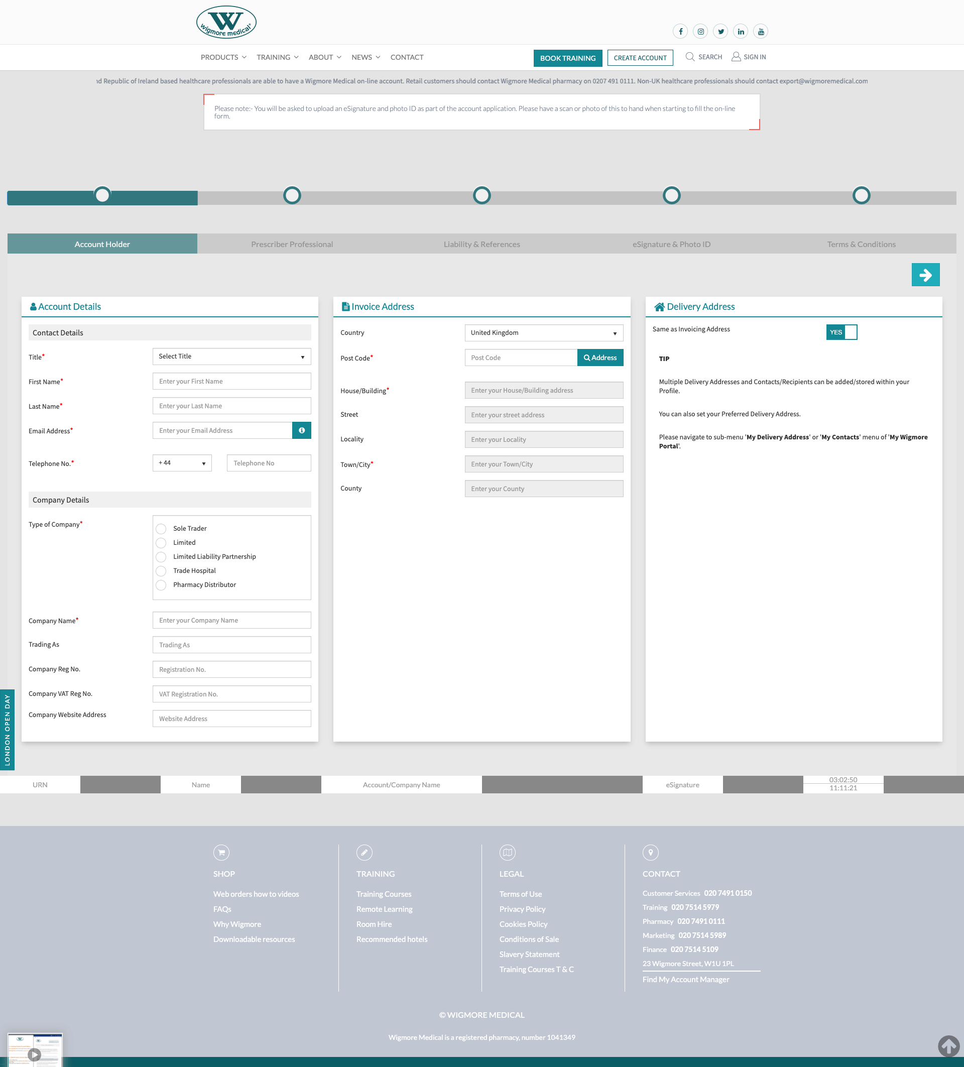
UI Designs
After completing and finalising the wireframes with the stakeholders and team, it was time to bring them visually to life. The previous UI was very outdated and cluttered, so I focused on giving the website a clear, concise design that would be
Old Previous UI Design
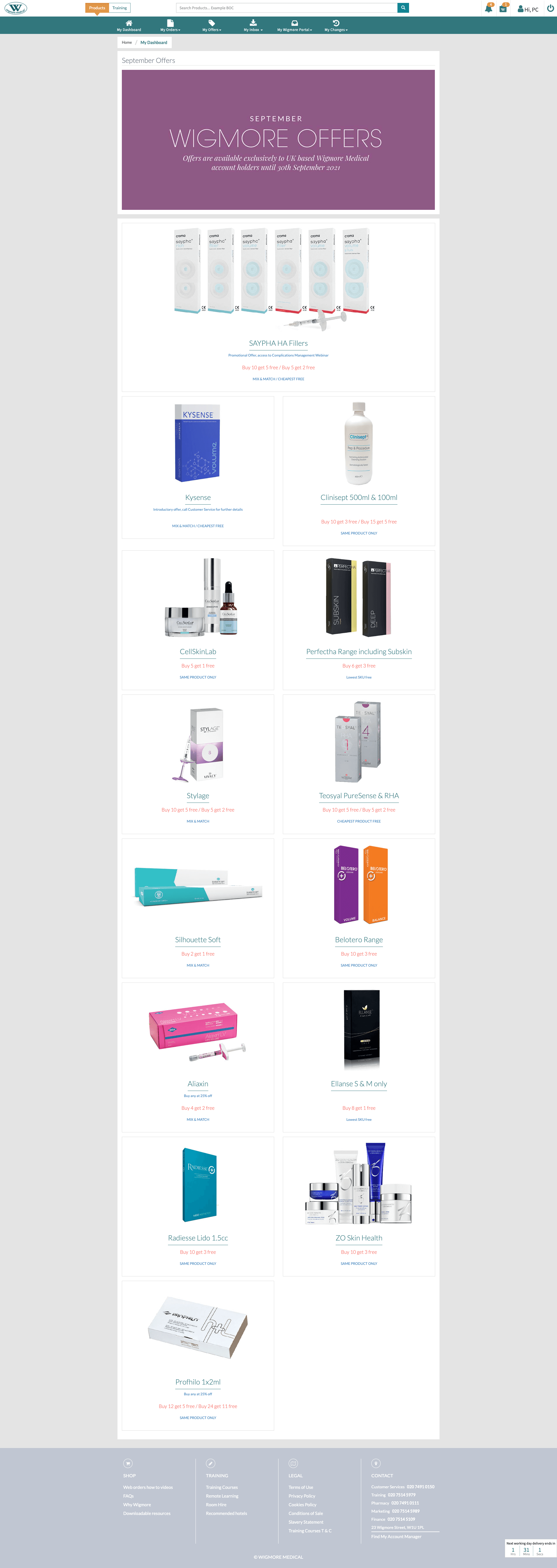
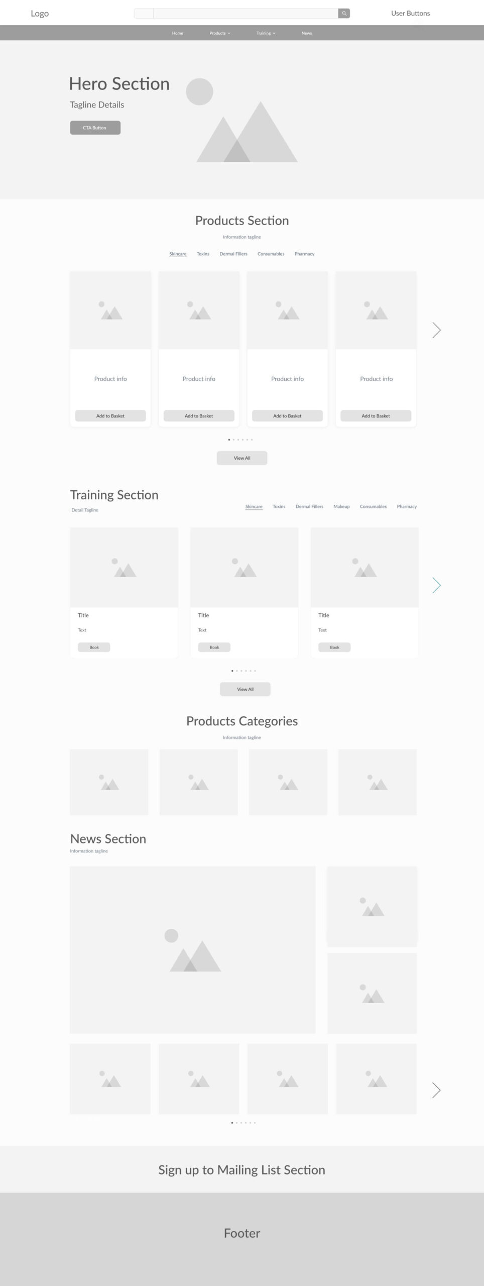
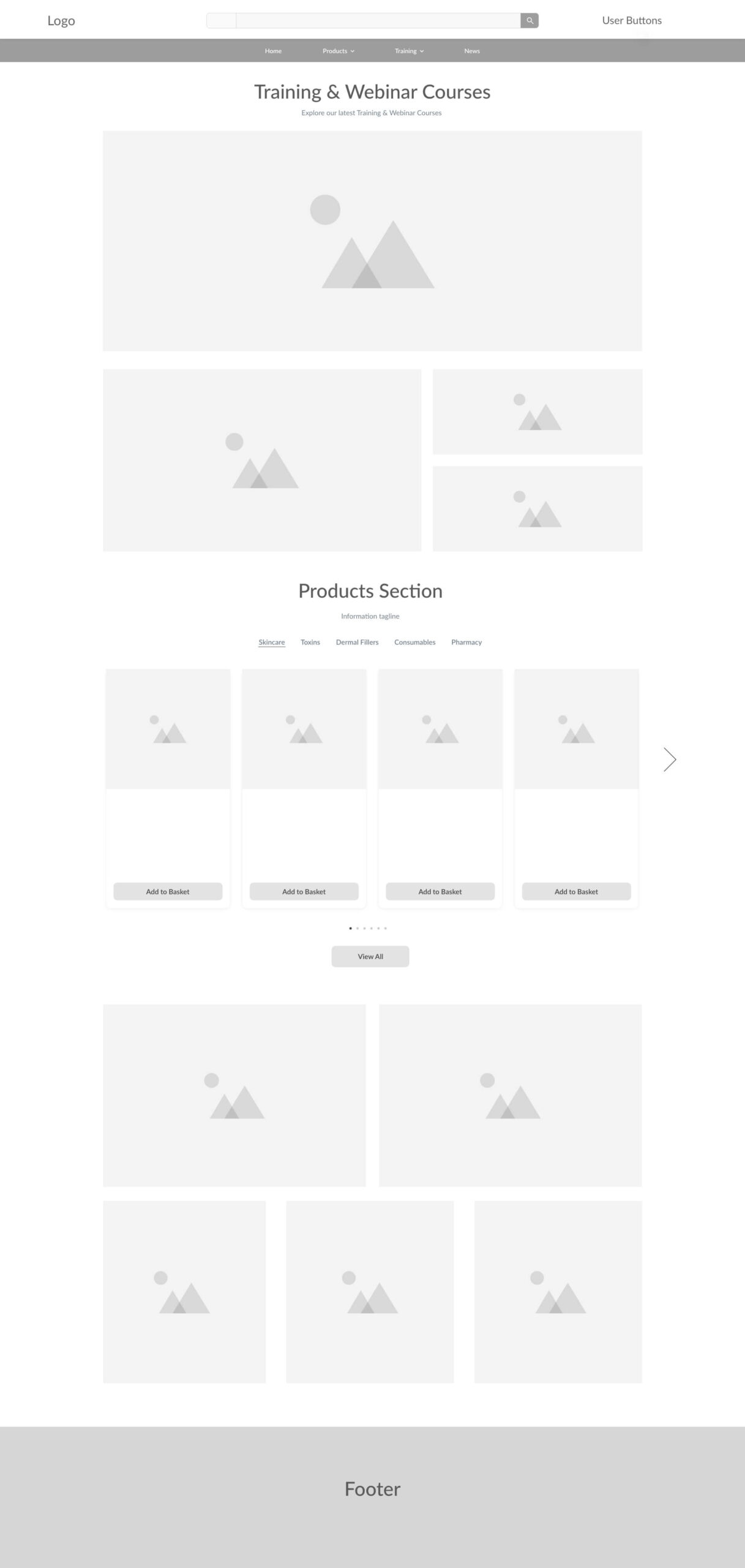
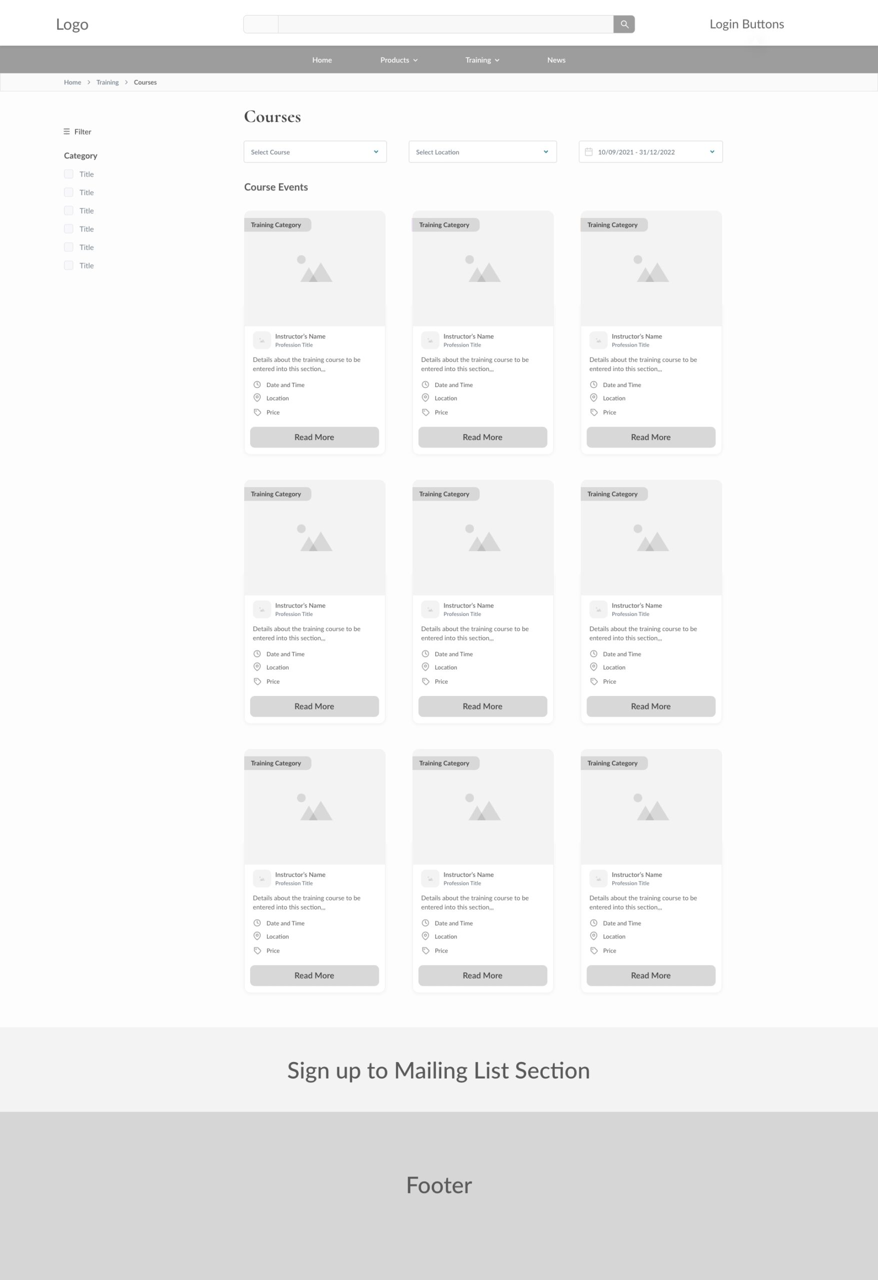
My New UI Design
Homepage - Desktop / Tablet / Mobile

Prototype
Using the pages I designed in Adobe XD, I then built a hi-fidelity prototypes for different journeys throughout the website for usability testing in order to observe how users interact with the site and identify where improvements could be made.
This journey shows the purchase of a product from the homepage right through to the checkout and completion, please click on the page and see where it highlights blue to see where the clickable links are.
5. Test
Usability Testing
With my prototypes completed, I started working on a test plan to guide the testing that would be conducted. I then recruited select participants who are trusted users of Wigmore Medical’s website and conducted usability testing in order to see how they interact with my design and identify where improvements to the design can be made.
Test Objectives
- Test if users can easily complete the tasks
- Observe the different paths users take to complete tasks
- Assess areas of improvement to improve the usability of the design
Tasks
We asked the participants to complete tasks such as:
- Complete new sign-up journey
- Search for a product using the new dropdown
- Complete a purchase for yourself
- Assign a tag basket to the Prescriber of your clinic
- Add a new Patient to your clinic
- Add a new contact to your clinic
- Assign prescriptions to your chosen patients
Summary
We conducted testing with 10 participants to make observations on how they interacted with the prototype and completed the tasks. We recorded each task to completed by the users and then had a discussion with the users to go over the process on what they liked and could be improved.
6. Reflection
After the great feedback from our participants, it helped me see some parts of the user journeys that could be brushed up on and improved. For instance, we added in more necessary filter options for the product display page and I designed a smaller navigation bar (height-wise) that fixed scrolled for users as they went down pages. The feedback was overall very positive and I was grateful for the constructive criticism that helped improve any pain points for the users, to make sure the UI was ready to be coded with the user’s experience at the forefront.